Friday, May 13, 2011

Powder Room - Entry

A powder room is a must near the main entry of the home, in my opinion.  After a long car ride, many often need to use the "facilities"!  When I use the term powder room, I'm referring to a simple half bath, consisting of a vanity, mirror and toilet.  Sarah did a beautiful powder room for her farmhouse, but as it's not really my style, this will be my first room post based on my own designs!

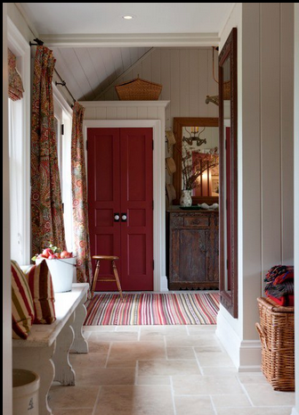
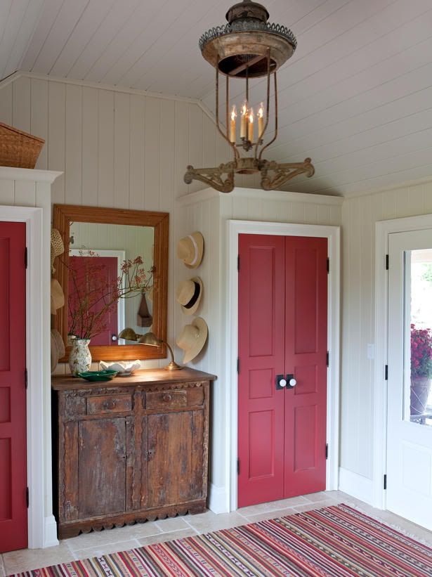
As the powder room connects to the mudroom, the styles need to compliment each other.  Let's start with the vanity, as it's really the only piece of furniture going into this room.  I love both of these:


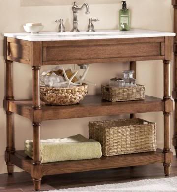
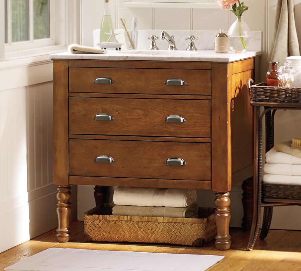
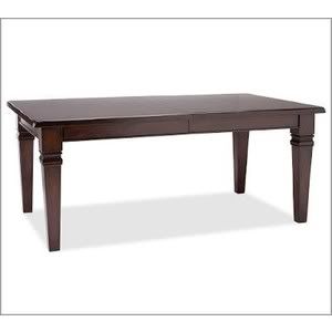
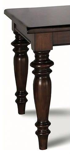
The vanity on the left can be found at http://www.homedecorators.com and is priced at $469.00.  The vanity on the right can be found at http://www.potterybarn.com at is quite expensive at $1699.00!  Neither comes with the faucet, so that would be a separate purchase.  As this is for a powder room, there's really no reason to spend $1699.00 on a vanity, in my opinion, unless you've got an unlimited budget! 

Add a great mirror and some lighting and the vanity on the left would look fantastic in any powder room!

If we were to do paneling up part of the wall, Sarah recommends that it be no shorter than 42" to avoid splashing the painted part of the wall.  She also highly recommends that the seat on the toilet be attached with the chrome hinges versus the plastic ones.  I wish I had known that last time we had to replace a seat, because the hinges on ours broke very quickly!

I haven't narrowed down a color scheme for this room yet, but will add that once I do!

Friday, May 6, 2011

Mudroom Entry

These days, many family homes have both a formal entryway and a family entryway/mudroom that is attached the garage. Since the latter is what we'd be using the most, I'll start there.  As previously mentioned, I've fallen head over heals with Sarah Richardson's style of interior design.  Sarah recently purchased and designed a beautiful farmhouse in Canada.  The design of the mudroom of this farmhouse is right up my alley!  


I love the subdued color scheme with a pop of red, giving this room a "schoolhouse charm".  For our mudroom, the only changes I'd make would likely be to the fabrics.  


Although I do like that rug!  It's from Ikea and comes in several sizes starting at $99! 


A tumbled marble cobblestone tile in a light beige color was chosen for the floors, similar to this color shown here: 

This is a great choice for flooring as it is a similar color to dried mud!


The wall and ceiling paneling is done in pine - imagine the wonderful smell!  Sarah used neutral colors for the wall, ceiling, and trim.  I was unable to find the swatch for the wall, which is listed on the HGTV website as Raindrop SR1 from Sarah's paint collaboration with Para Paints, so I got as close as possible with Shortbread SR35, which may be too dark.  The ceiling is called Vintage SR4, the trim is Snowfall SR29 and the closet doors are Orchard SR53 (note: Sarah says when painting a with red to prime it in grey first!): 


Walls                                            Trim


Ceiling                                         Closets


For the hanging light, I would choose something a little simpler, more like these: 


Both are from Pottery Barn, the smaller one is listed at $159.00 and the larger at $319.00

We have a beautiful church pew that would go in our entry, in place of the white bench Sarah has in hers.


I did manage to capture a few screenshots of the entry doors from this mudroom as well - please forgive the poor quality!


This one leads out to the front of the house.


The second door in Sarah's Farmhouse leads out back.


Wednesday, May 4, 2011

Design Style

This is what I always have a challenge narrowing down.  If I had to describe my style/tastes in one word, it would be eclectic.  However, eclectic is too broad for this project.  So I decided to take one of those "Find Your Style" quizzes and got the following result:

Sophisticated

Your design style is mixed. Call it traditional elegance meets modern lines. In your home, sophisticated looks contrast perfectly with updated twists. For example, "You might find the classic lines of a Louis XV chair in a dining room set with a modern textured fabric," suggests Julie Rackley, an interior designer in Bellevue, Washington.
The best color palettes for your look include dark browns and soothing neutrals. Rich accent colors complete the mixed antique modern look: tapestry blues, muted blue-greens, champagne and warm peachy tones. Your style includes a range of fabrics from silk to mohair to linen to velvet.
Your style isn't the only thing with a combination approach: your space is perfect for anything from entertaining friends and family to intimate gatherings around the kitchen table.

Design Tips for Sophisticated

To add a touch of elegance to your home décor by investing in just one luxurious item to contrast against a more modern backdrop – a crystal lamp in your bedroom, a Persian run in the front entry, an antique cherry desk in your office or perhaps a deep red velvet chair with carved wood armrests and feet by the living room fireplace.


I must admit, this is pretty spot-on...which is likely why I love Sarah Richardson's work. She has a way of blending antique pieces with the clean lines of modern pieces, resulting in a classic and timeless look.

I love furniture with clean, but not harsh contemporary, lines.  For example, here's a picture of the dining room table we bought (right).  This table came with either round "turned" legs, or the straight legs pictured here.  We opted for the straight legs because we felt the round legs were just too fussy - a little too traditional for us.


Round legs we passed on:


So sophisticated, traditional elegance meets modern lines it is!  As we're hoping that our new house will be out in the country, perhaps with a few acres of land, I'm going to throw a little bit of country/farmhouse in the mix too, but not too much.  I really don't foresee us decorating an entire kitchen with pigs or roosters!

Tuesday, May 3, 2011

Design Inspiration


I've always enjoyed watching interior decorating shows on TV, but the last few months I've found the designer that most speaks to my decorating style...Sarah Richardson.

Sarah is a Canadian interior designer who started her career as a "behind-the-scenes prop stylist and set decorator."  She eventually created Sarah Richardson Design, Inc. and today is one of Canada's best known designers.  She is the star of shows such as Design, Inc., Sarah's House 1, 2, and 3, Sarah 101 and the upcoming Sarah's Summer House (which I believe is the same as Sarah's Cottage). She flawlessly blends traditional styles with modern and the result is not only beautiful, but timeless.

As I start this little adventure, I'm certain the phrase, "What would Sarah do?" will be used often!


My other favorite part of Sarah's shows and design-capades is...Tommy Smythe! Tommy is Sarah's "design side-kick" and is a breath of fresh air.  His quick wit and enormous personality is enjoyable to watch.  He and Sarah have created design magic, in my opinion!

As we narrow down what we'd like to create for our own home, I'll be referencing photos of many of Sarah and Tommy's designs.  So sit back, and enjoy the show!

Thursday, April 28, 2011

And so it begins...Loves/Dislikes

I've started this blog to create a central location to house inspiration ideas/pictures for the house we'd like to build.  Although my husband and I have a beautiful home, we've recently decided that it's just not the home for us.  We've sifted through hundreds of houses for sale online and just haven't found anything we're terribly interested in.  Thus the notion of building what we truly want came to life.

When we purchased this house a few years back, we got an AMAZING deal because it was a "Buyer's Market".  There are things about this house that we LOVE, and some that we don't.  Our hope is that we can take the things we love and apply it to our new house, while fixing the things we could live without or dislike.

We also felt like we sacrificed having land because we got such a great deal.  I grew up in the mountains of Colorado.  We didn't have a lot of land there, right about 2 acres actually, but looking back, it was wonderful.  We've come to realize in the last few years that we'd prefer to NOT live in a subdivision...or if we do, we'd need a much larger lot size so that we aren't looking in the neighbor's back yard.

Now on to our list of Loves/Dislikes:

LOVES:
  • Vaulted ceilings - we've got 10ft ceilings on the first floor!
  • Kitchen size - we've got a wonderful kitchen with a great island in the middle and an eat-in area as well
  • Granite counters
  • Crown molding - throughout...love it!
  • Floor plan style - squared/symmetrical rooms
  • Formal dining
  • Master Bedroom size
DISLIKES:
  • Location, Location, Location
  • Lot size
  • Thomas wants a larger garage
  • Style of the exterior
  • Small front porch and back deck

That's it for now - next post will be design inspiration!!